Stanford DoResearch
Stanford University’s DoReseach website is the home for everything related to research at Stanford. Their website needed a design refresh and user experience improvements to better serve their audiences.

This project began with a navigation audit in which I identified major changes that would greatly simplify their navigation. I restructured the sitemap and designed new navigation patterns that presented users with robust mega menus and color-coded each section of the website to improve wayfinding.
The interdisciplinary research happening at Stanford crosses boundaries and tackles large problems. A major goal of the design refresh was to bring more of the human element behind the research into the website. The new site features strong imagery and a library of new media elements that seamlessly integrates with the content.
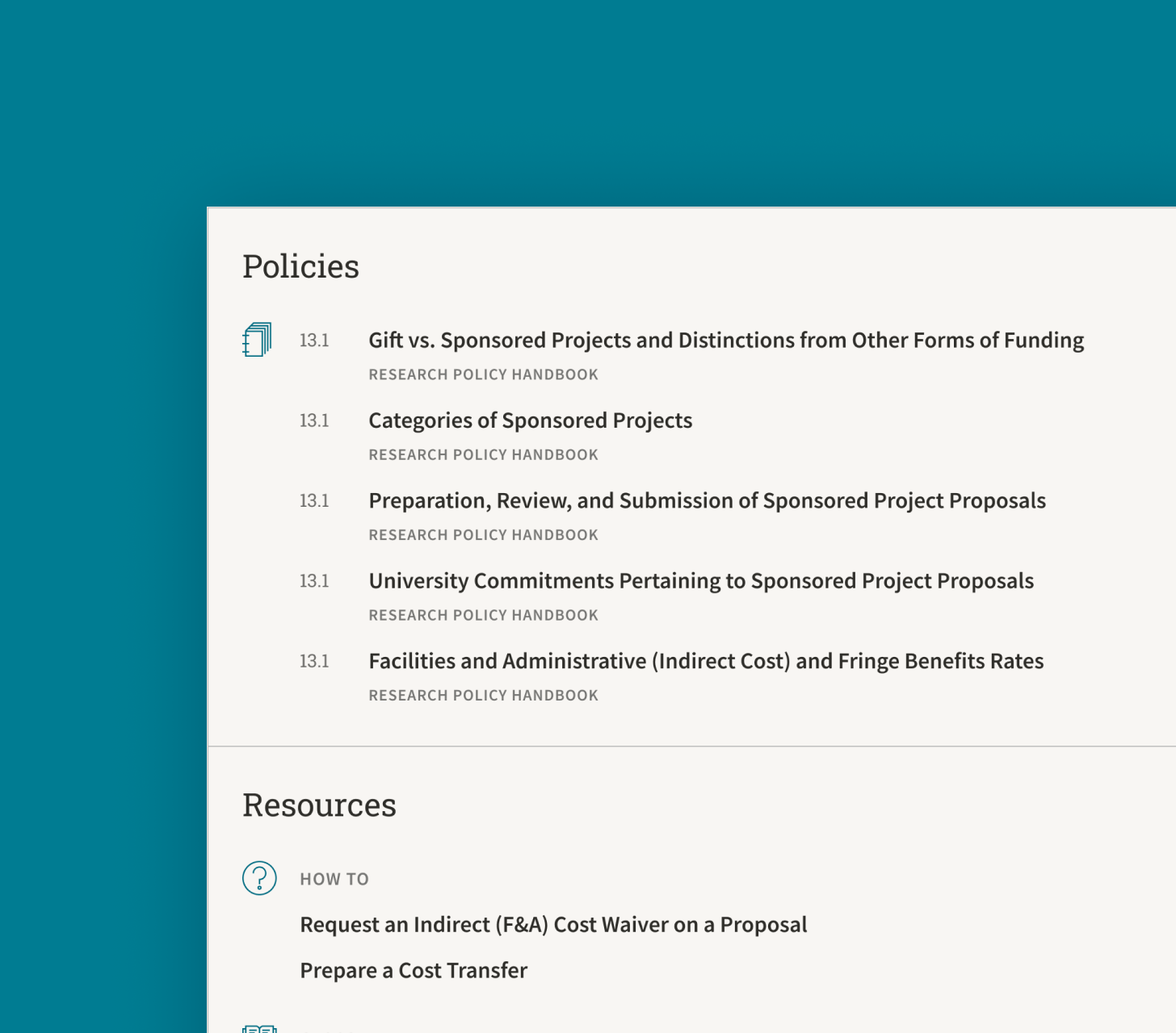
The new design includes refined type applications for an improved reading experience and a revised grid system that supports flexible media structures.


