Smithsonian Q?rius
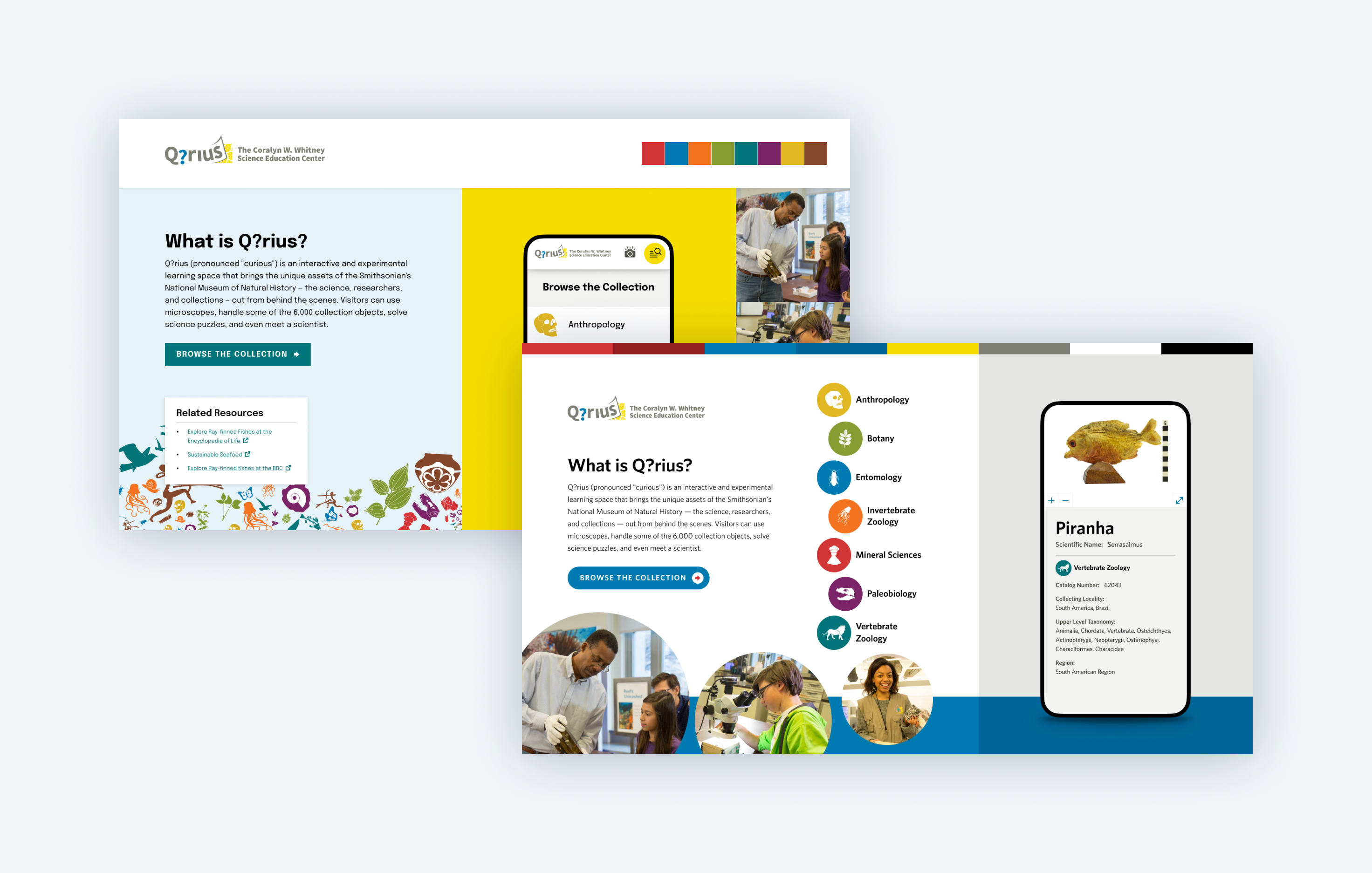
Smithsonian Q?rius is an “interactive and experimental learning space at Smithsonian’s National Museum of Natural History.” It’s an experience that lets visitors explore the Museum’s vast collection both in-person and using a custom web app on their own device.

Challenge
Smithsonian’s Q?rius exhibit featured kiosks running a custom website where visitors could look up information about the collection. With a global pandemic making it impractical to use shared touch screens, The Smithsonian decided to invest in a web app that would work from any device using QR codes throughout the exhibit to connect visitors with the collection.
Process
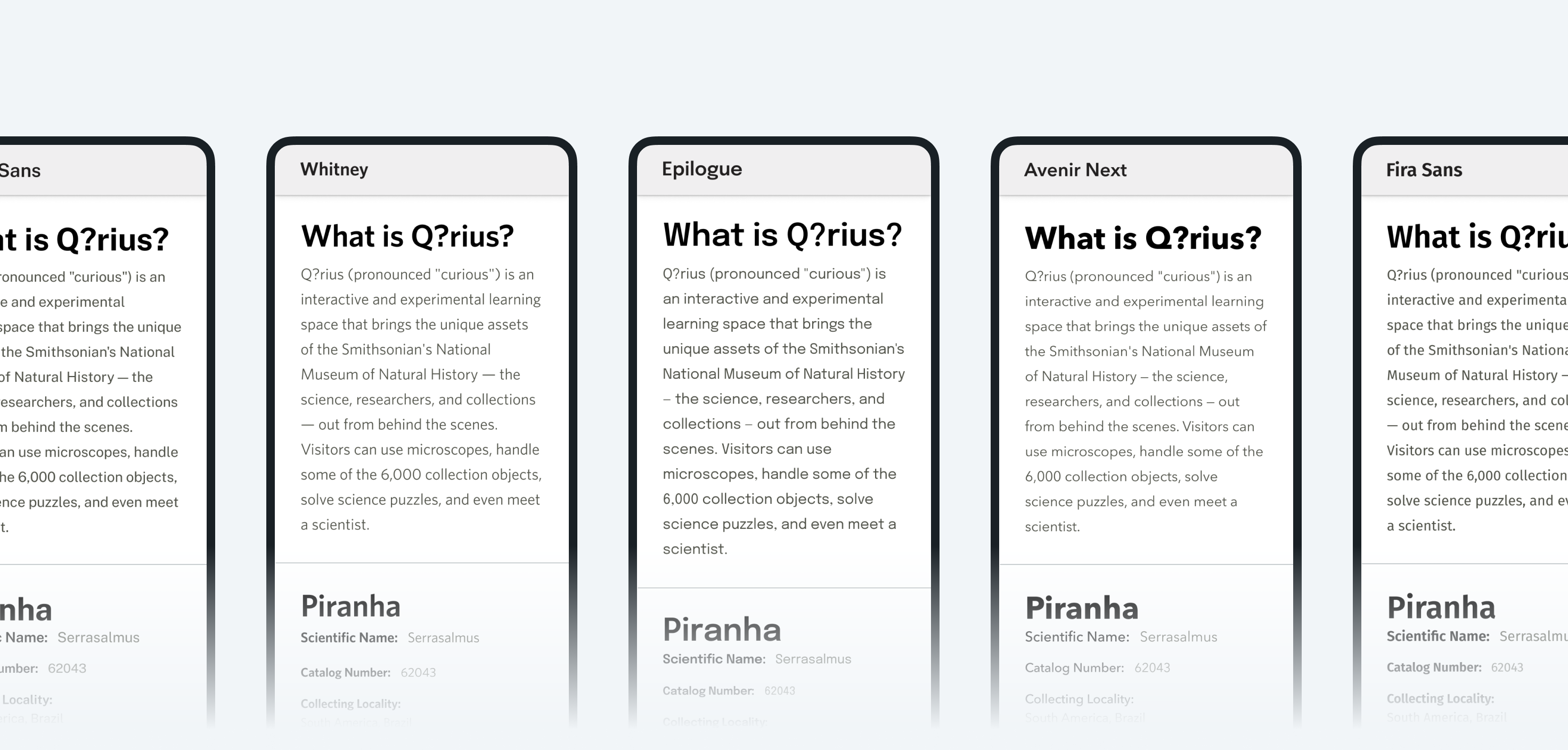
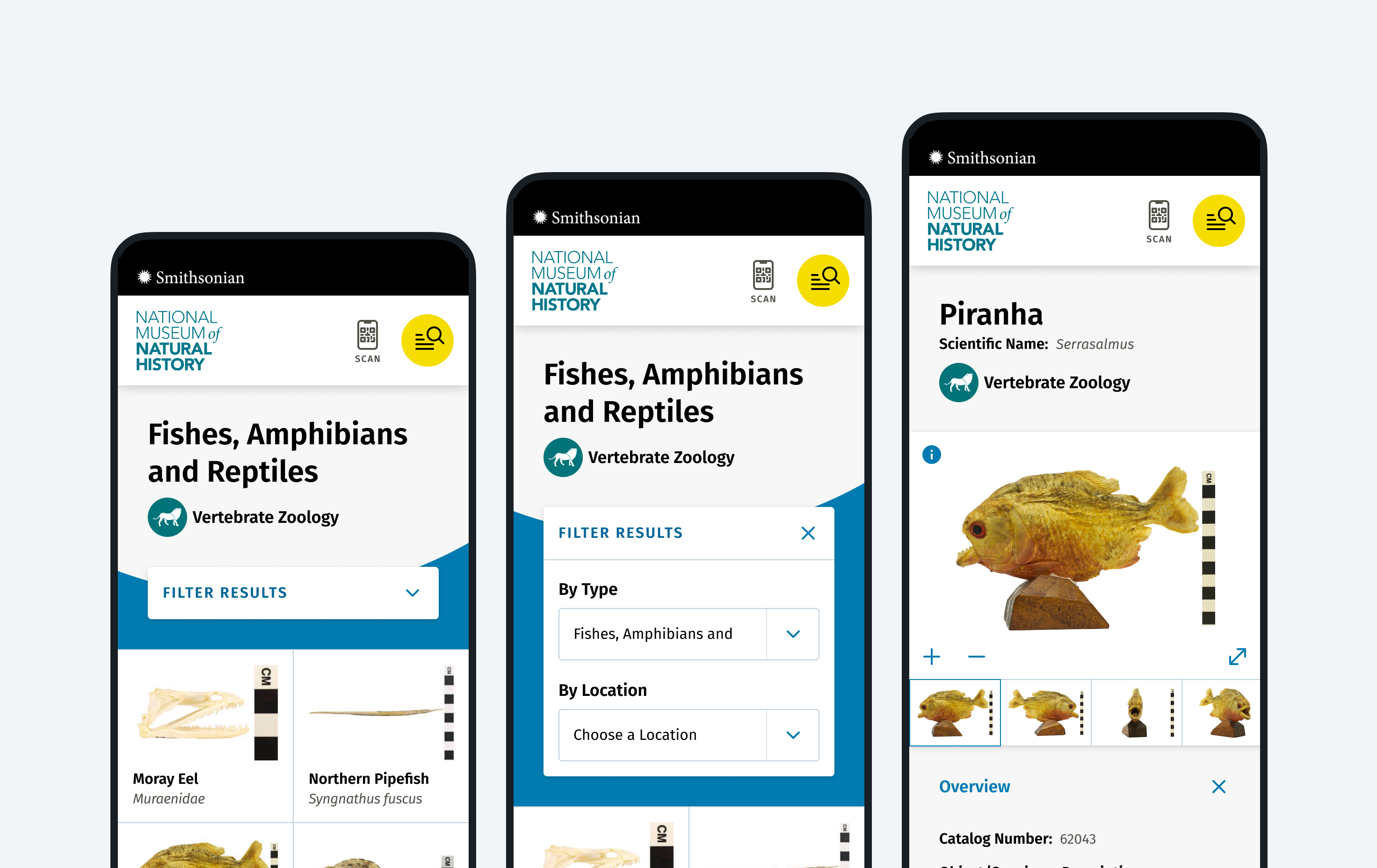
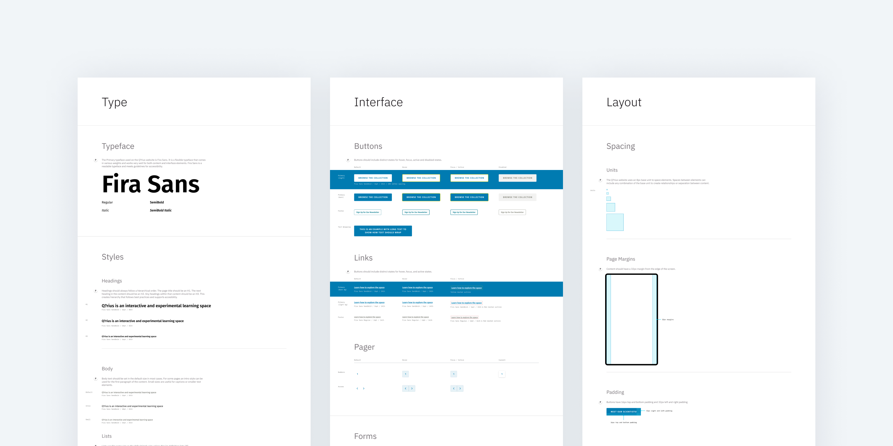
The design phase of this project involved discovery meetings and workshops to understand the Q?rius brand and how it fits within the brands of the Museum of Natural History and the Smithonian. I presented type options and Style Tiles to nail down foundational design elements and develop a shared vision for the new app. Using a mobile-first approach, I then created interactive, high-fidelity prototypes showing the ways users could browse the app and interact with the content. Once I received sign-off on the design, I created documentation for the design’s components, colors, typographic system, and structure.
Solution
- I created a new design for the Smithsonian Q?rius web presence that mirrors the physical space of the exhibit.
- The new web app is responsive, accessible, and performant, working on any device but targeted specifically for mobile screens.
- A consistent link to scan a QR code makes it easy for visitors to instantly learn more about a piece or find related items.
- An intuitive icon-based navigation system incorporates artwork from the exhibit to encourage users to browse and dig deeper as they navigate the app.
- The design documentation provides developers guidelines for the color palette and its usage, typographic rules, UI elements, and page structure.
