IUCN
The International Union for the Conservation of Nature (IUCN) is the world leader in research and publications about the natural world and its preservation. Following a strategy and information architecture phase, they were ready for a design that would communicate their 70+ years of vision & impact.

Challenge
IUCN had just completed work on strategy and information architecture as part one of their three-phased project. They were looking for a design partner to take that work and create a compelling design communicating IUCN’s 70+ years of vision & impact. They needed a robust authoring system to tell their story, incorporating images, quotes, videos, and other media to enhance their storytelling capabilities.
Process
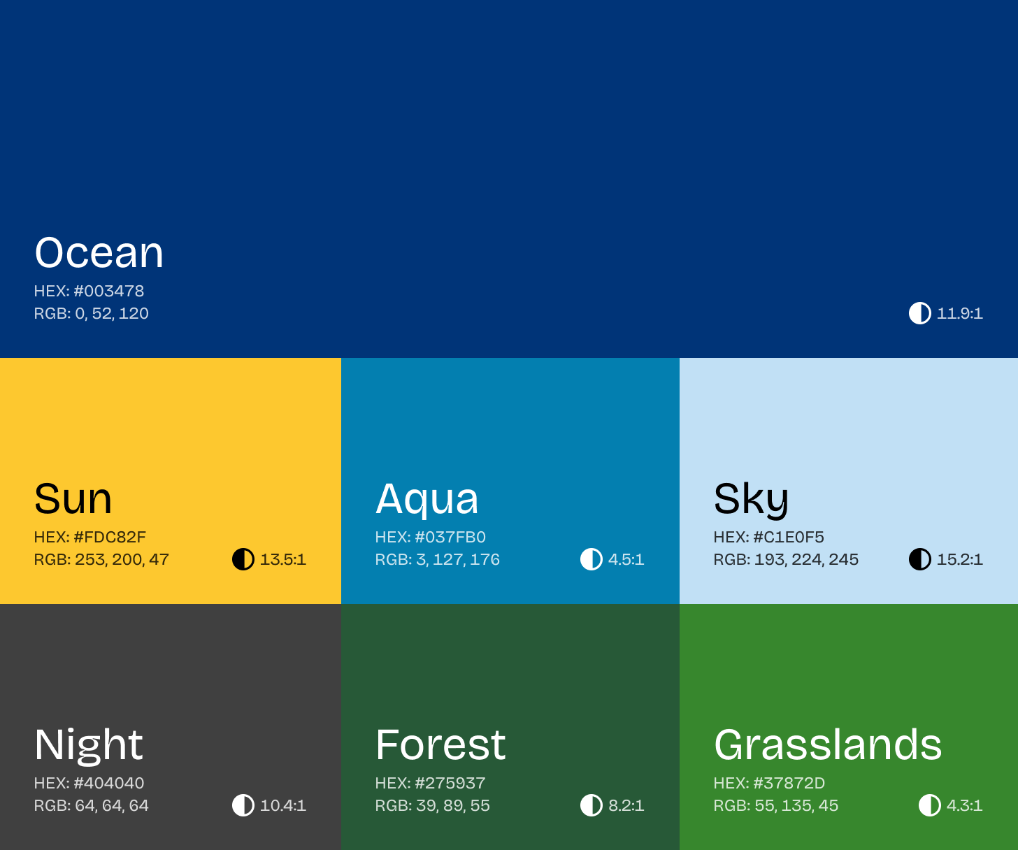
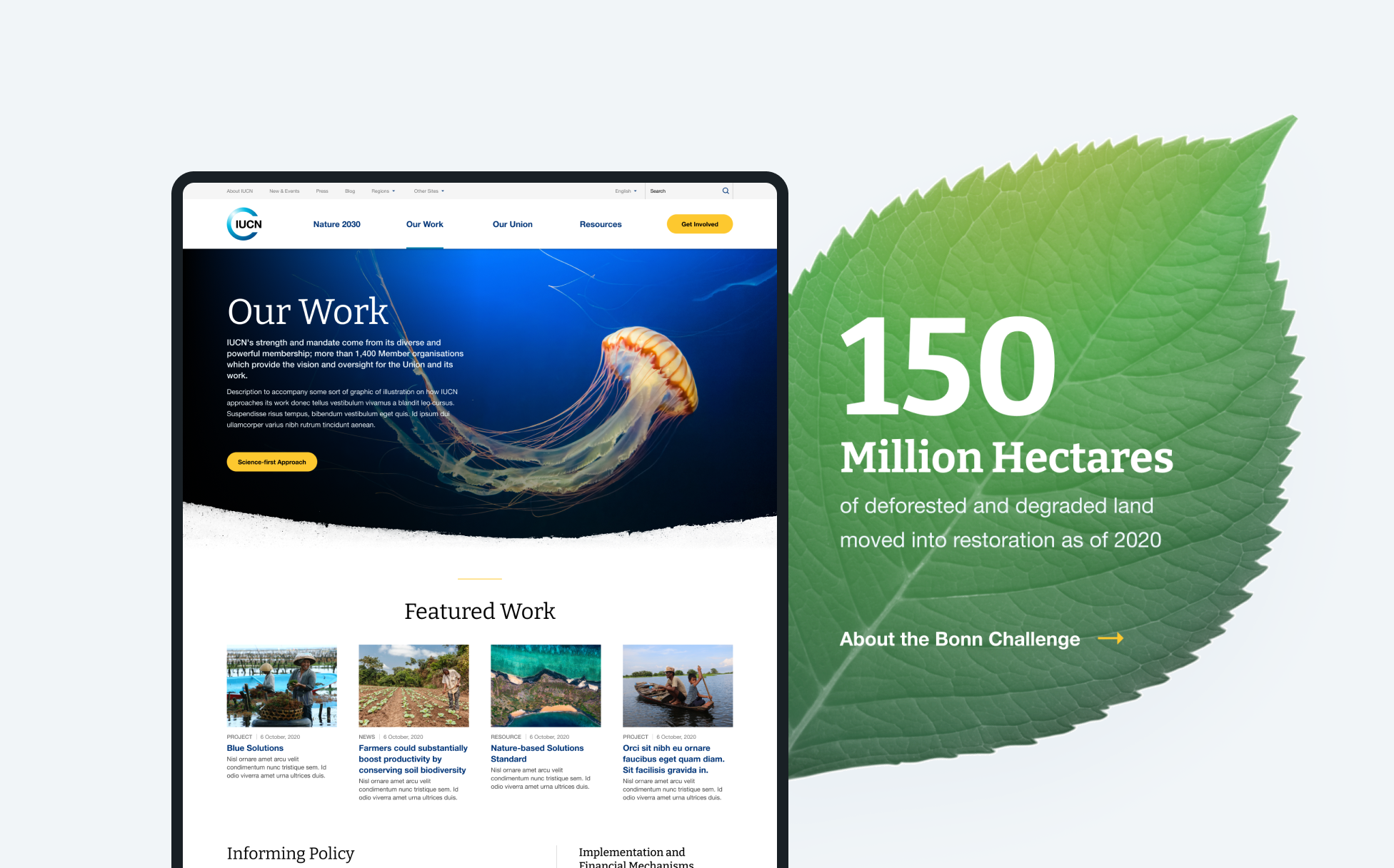
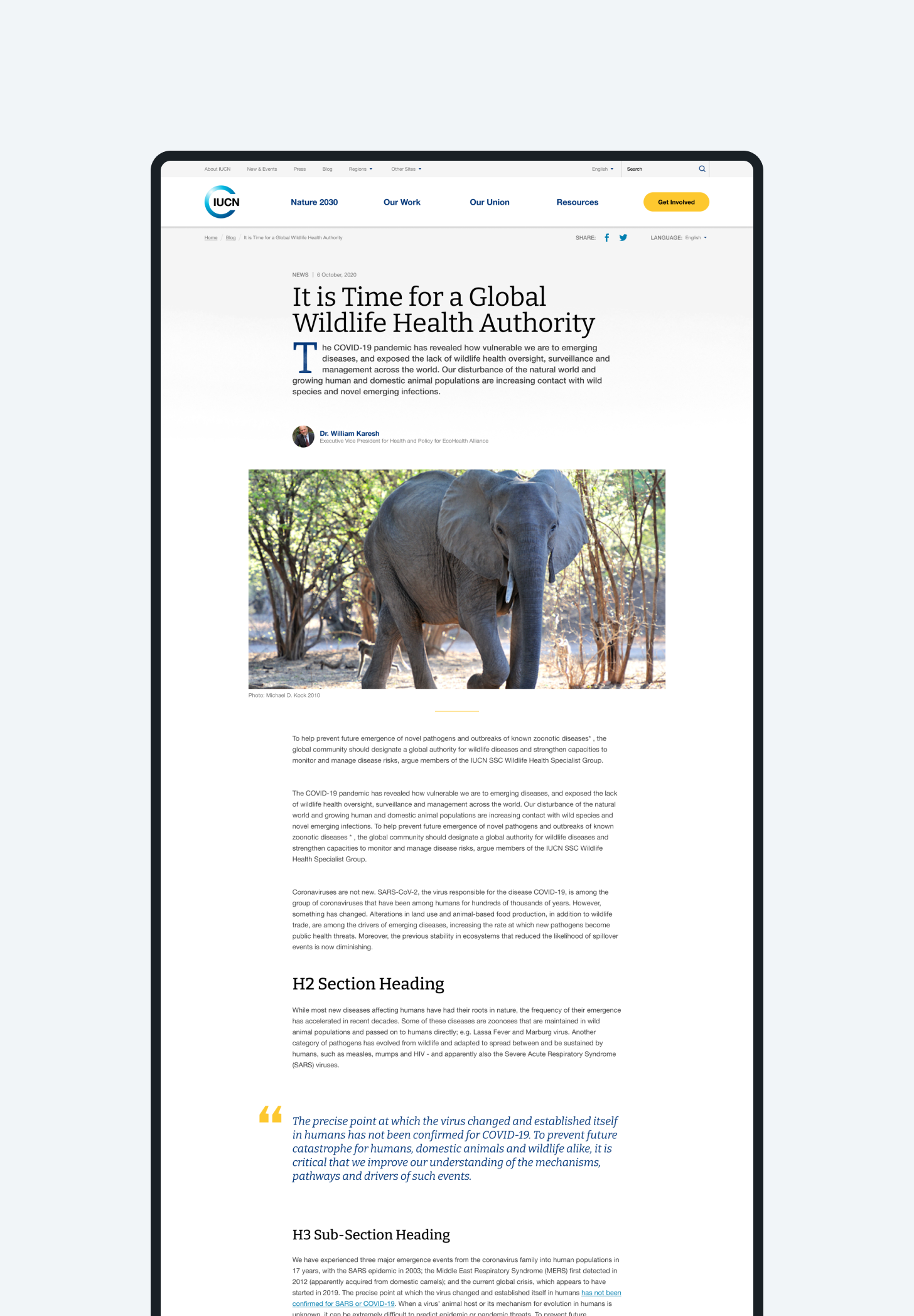
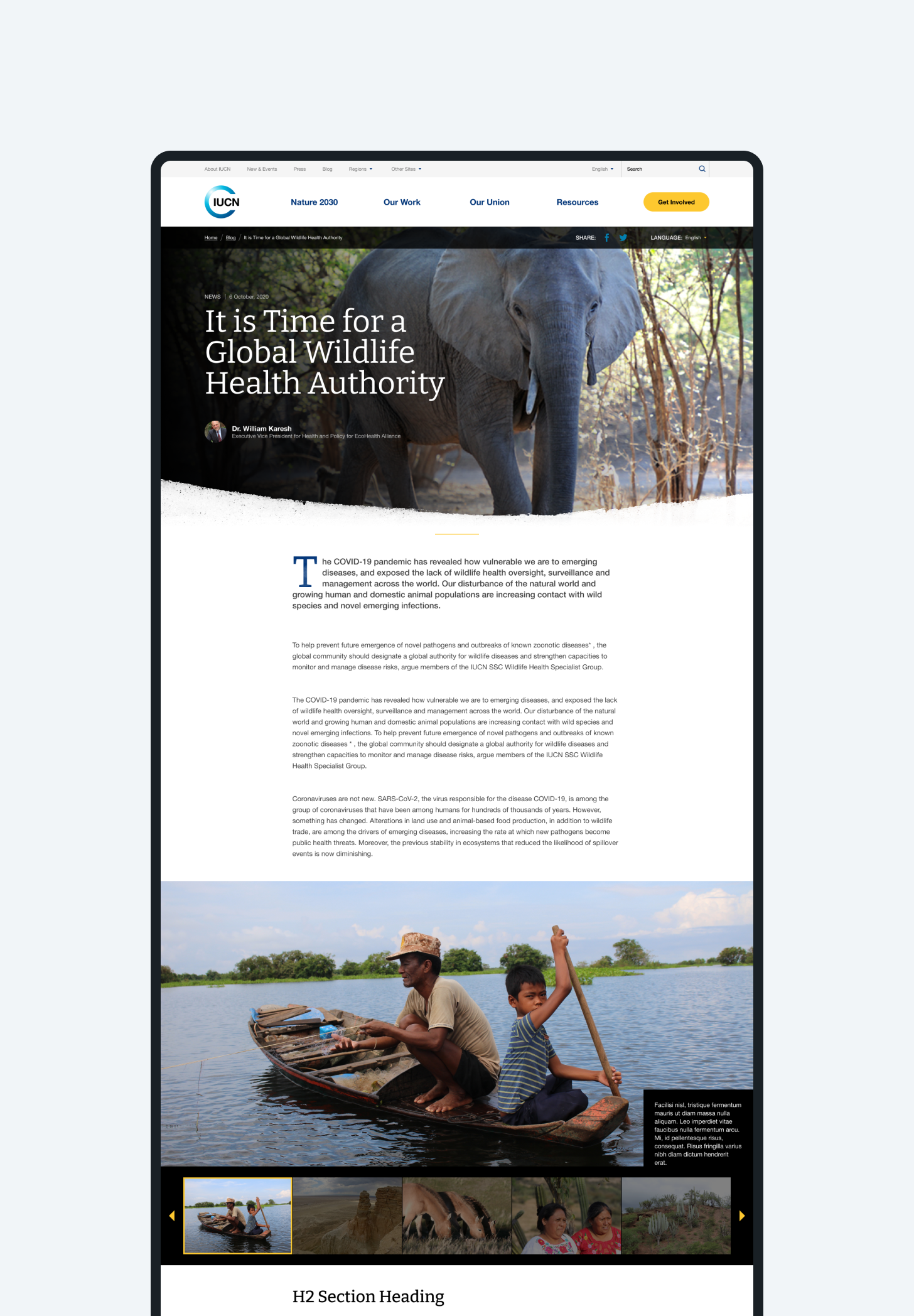
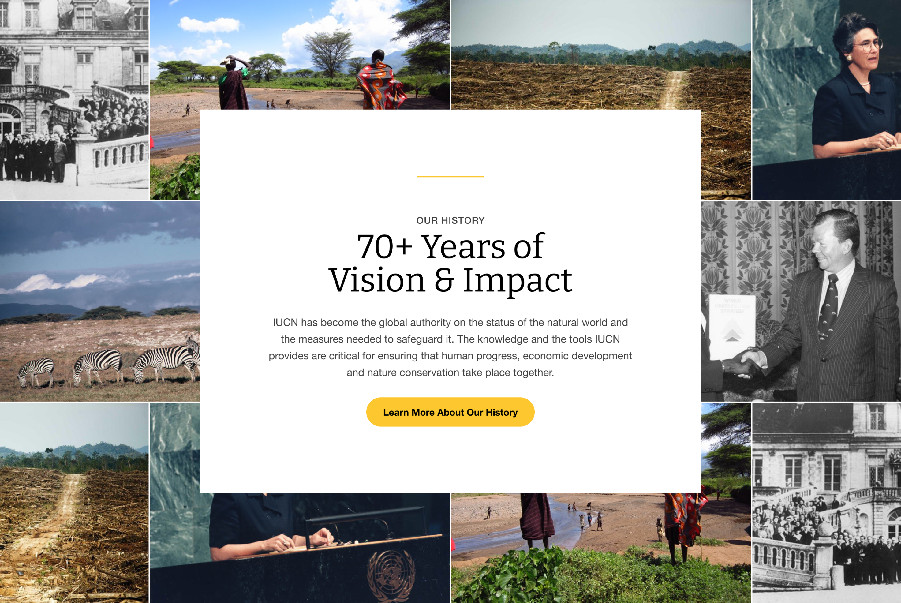
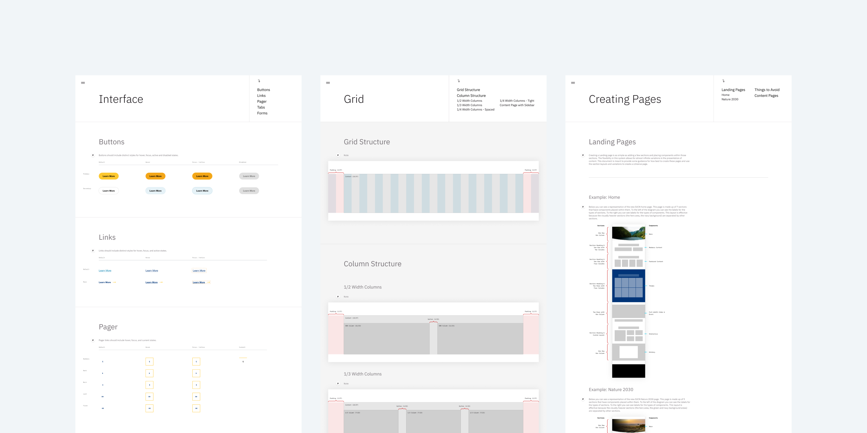
My work with IUCN began with workshops designed to understand their aspirations for the new website. Using that learning I created design exploration in the form of Style Tiles, establishing a color palette and typographic pair that would become the foundation for the design. After discussing initial design ideas, I moved on to creating high-fidelity page comps to demonstrate visual hierarchy, navigation patterns, and flexible page structures that adapt to different screen sizes. Finally, I created documentation of the design — including color palette, typography, grid system, and user interface elements — for the development team. I also created visual guidelines for authors to use while authoring new content.
Solution
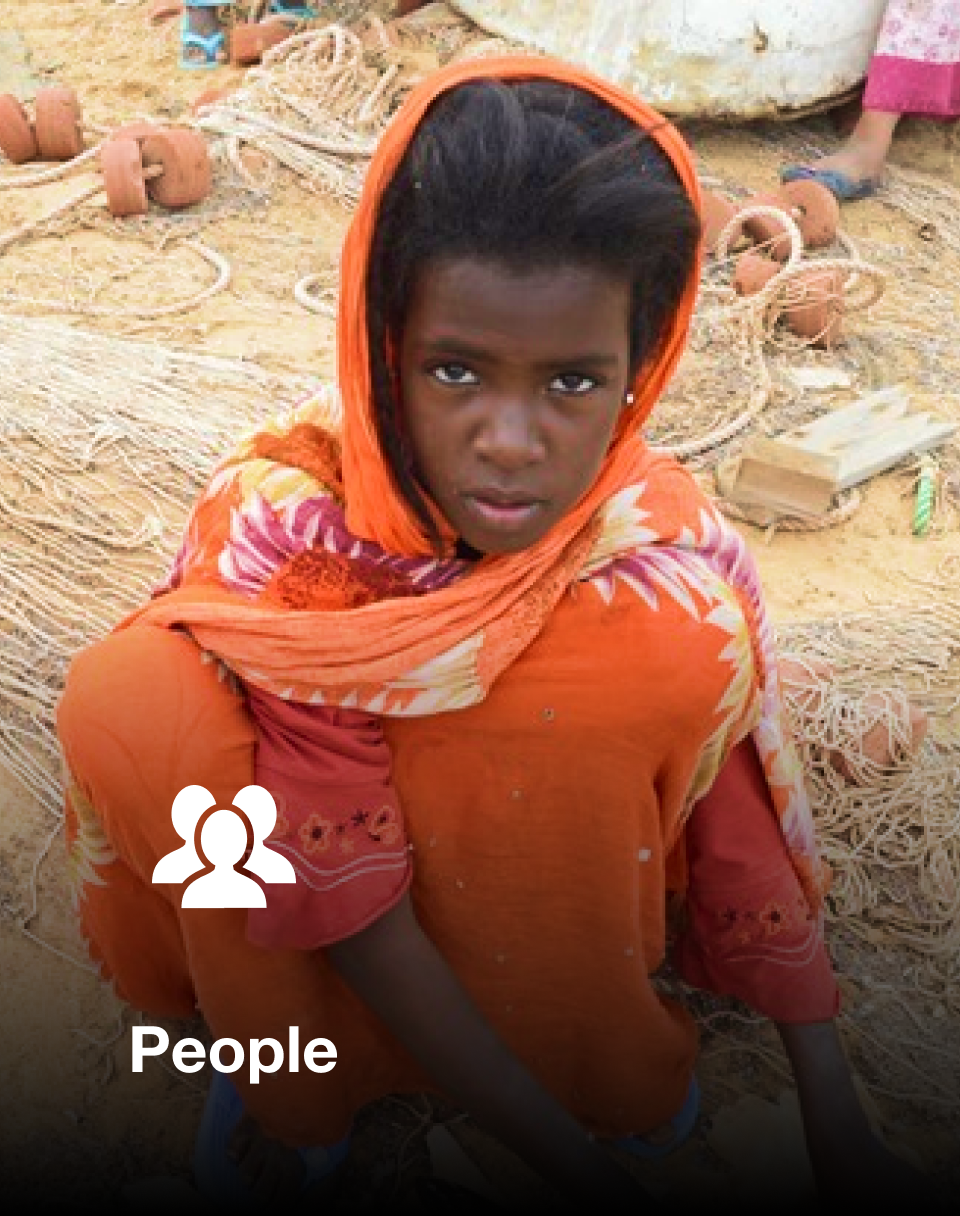
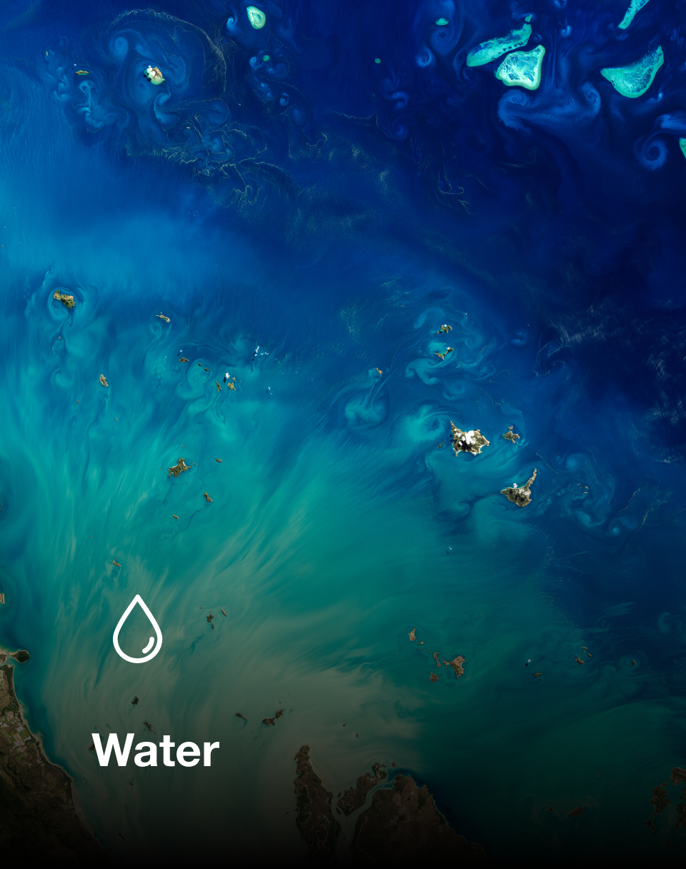
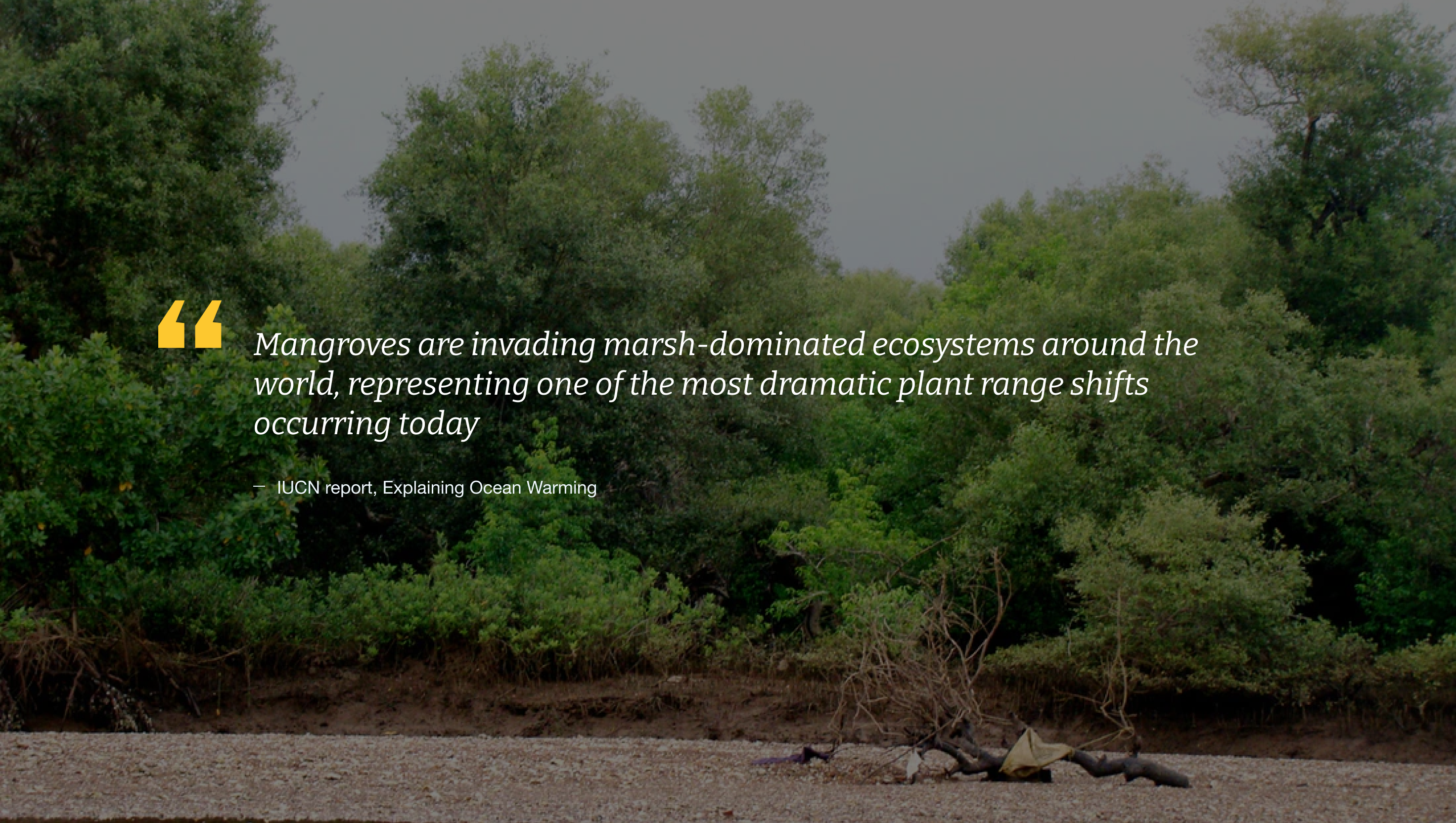
- I created a visual language — using engaging photography, iconography, and natural textures — that amplified IUCN’s work.
- A robust library of media styles and a flexible typographic system empowered editors to seamlessly develop long-form stories and articles all within the Content Management System.
- Thorough documentation of the design system provided the development team the tools they needed to implement the design.
- Visual guidelines for content authors ensures continued integrity of the website’s design.

