Millikin University
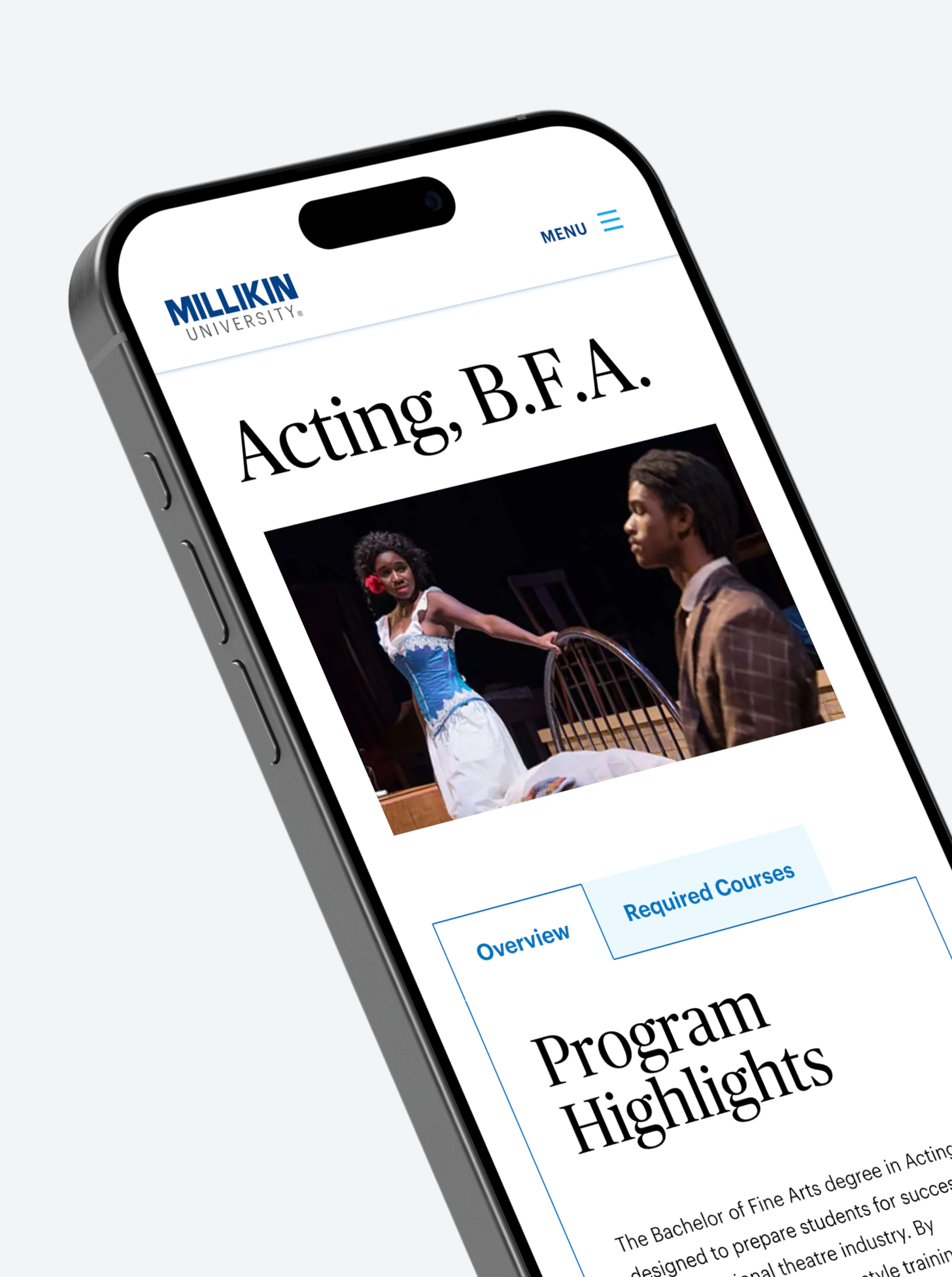
Millikin University is an independent university that provides students with an immersive educational experience. They needed a new website to better engage with prospective students.
Challenge
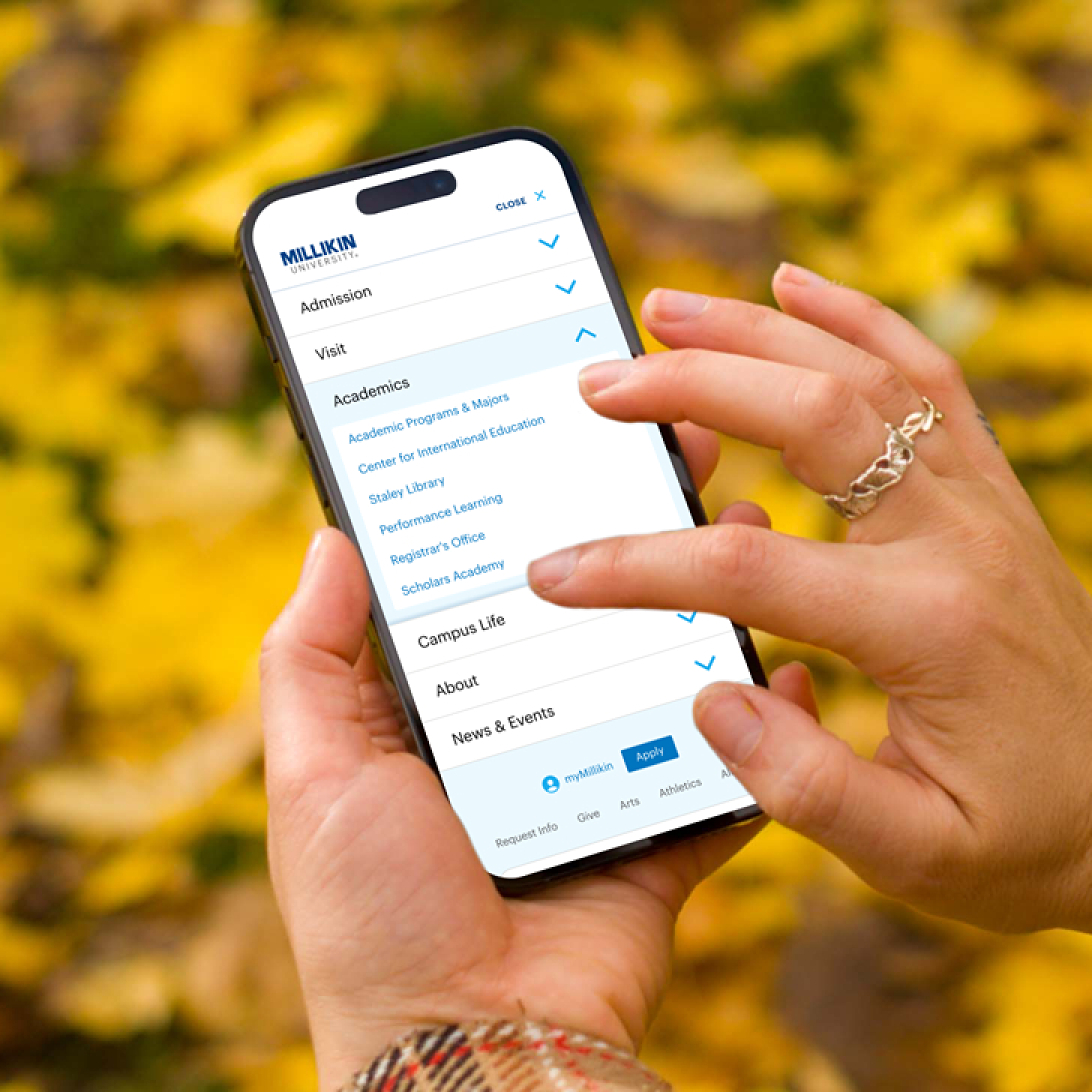
Millikin University needed a new website to better engage with prospective students and their parents, current students, faculty and staff. The previous website failed to reflect Millikin’s brand and its modern approach to learning. On top of that, a complicated navigation structure made it challenging to find the right content and a large portion of their users weren’t getting the best experience across devices.
Process
The design process began with stakeholder workshops to understand brand attributes and establish design goals for the new site. I developed Style Tiles and type pairings to explore potential themes and met with stakeholders to share design vision. I then created high-fidelity designs and interactive prototypes for major pages of the website, incorporating feedback throughout the iterative process. To wrap up the design phase, I documented the design system in Figma with specific guidelines for color, typography, UI elements, components and page structure.
Solution
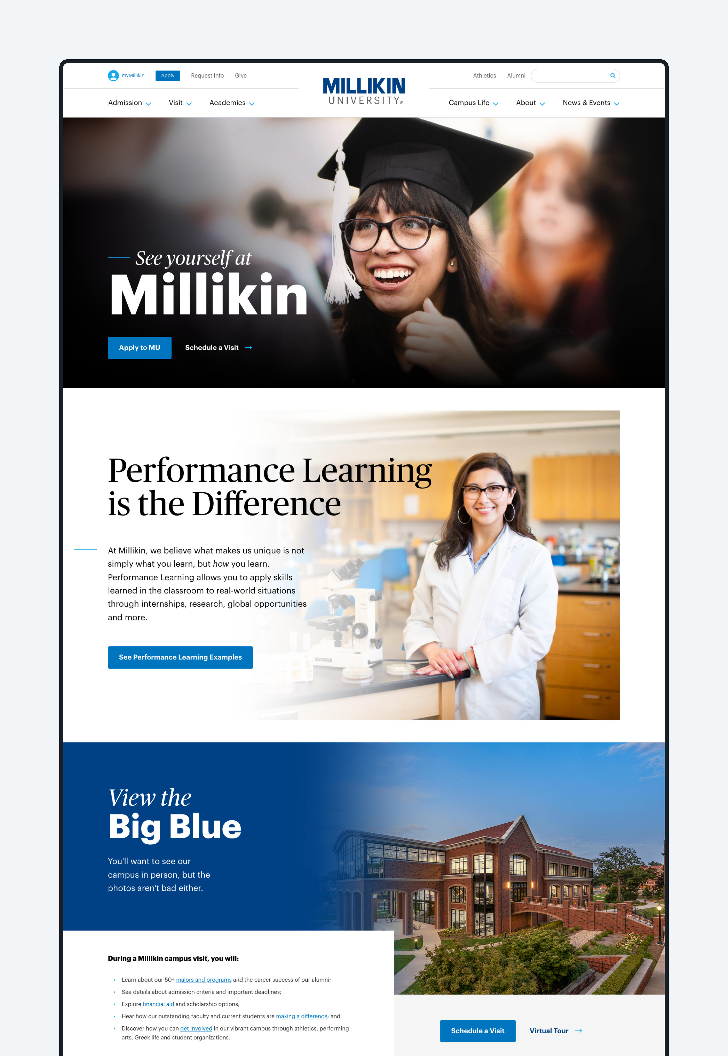
- The new design reflects Millikin’s vibrant, personable brand attributes and includes a sophisticated type pairing, a reimagined color palette, and a layout that encourages reading and drives potential students to apply.
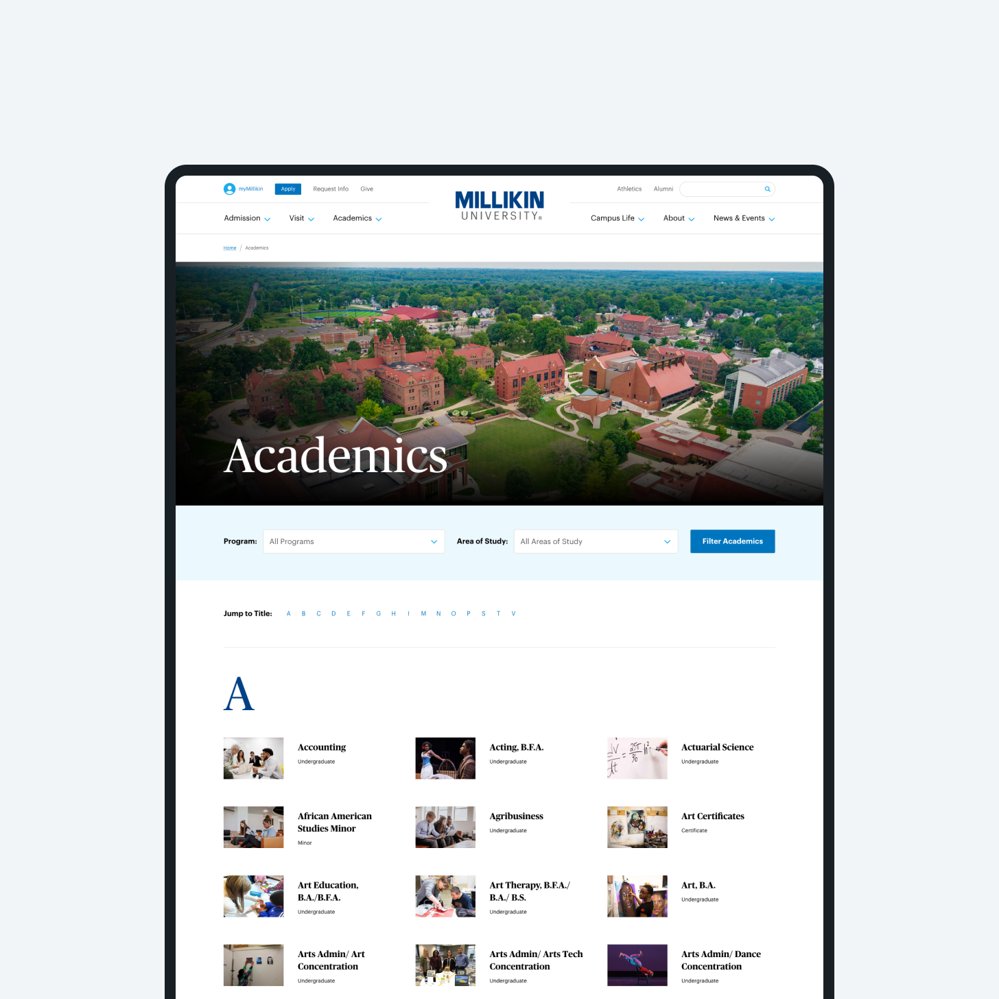
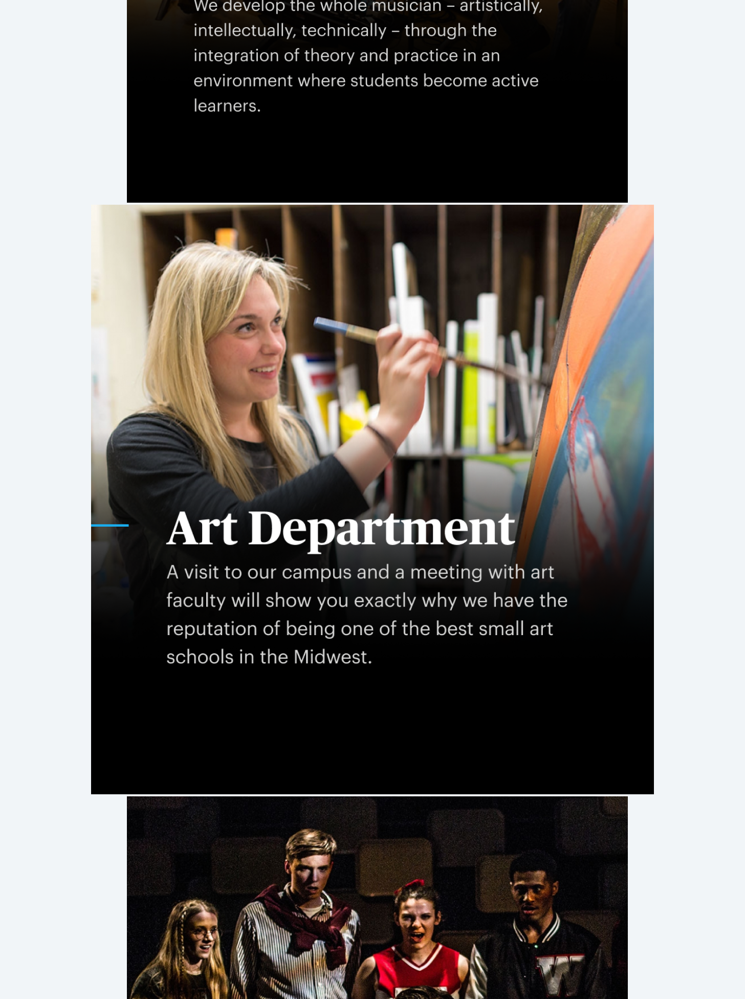
- The website showcases the breadth of the university’s majors and programs and highlights the students who attend Millikin, using photography throughout to better connect with the website’s primary audience.
- A new site structure — including more than 1000 unique pages — streamlined the navigation and an in-page contextual menu provided users with relevant links and related content while browsing.
- A comprehensive design system meant the new Millikin website was built on a strong foundation with room to grow in the years to come.

