Other Work
In my 25 years as a designer I’ve had the opportunity to work on a number of amazing projects. The projects listed here are a sampling of some of my favorites. Take a look at my work for The Tech Inclusion Pledge, NEON Science, and Tampa International Airport.
The Tech Inclusion Pledge
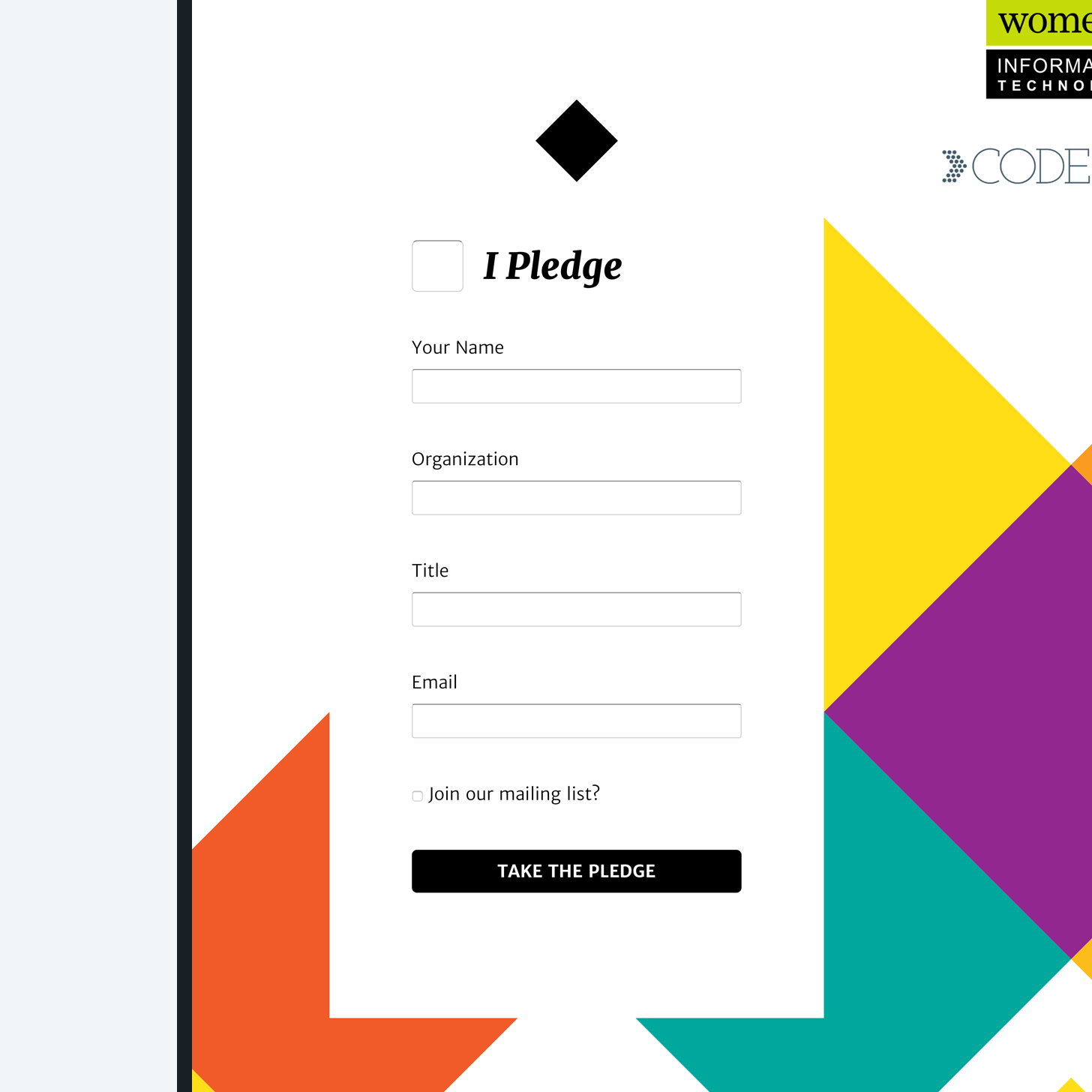
In the summer of 2016, the White House launched the Tech Inclusion Pledge, a promise by more than 30 tech companies to increase diversity in the workforce. I created a logo for the initiative and a website to encourage more companies to sign the pledge.
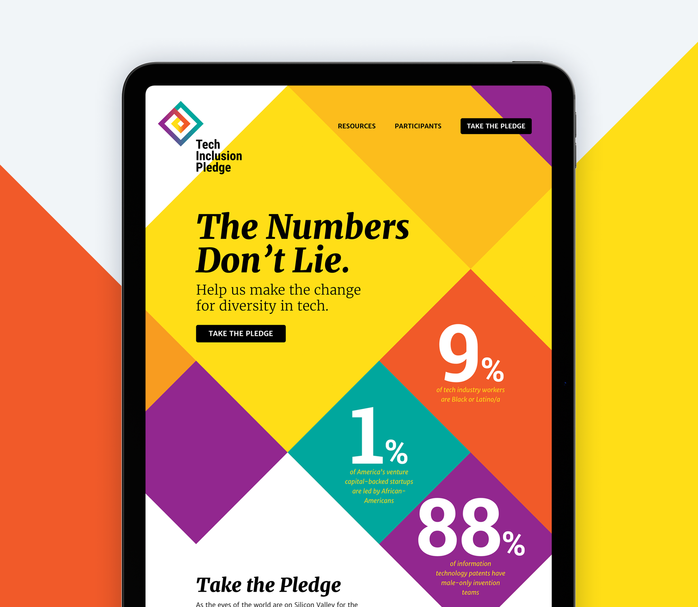
The Tech Inclusion Pledge needed a website and logo to support the new initiative. I created a mark that embodies the inclusive spirit of the pledge, using a vibrant color palette and concentric squares.
To expand upon the new brand, the website uses the same bold colors in overlapping, angular shapes. Negative space and verticality resulted in a simple, yet effective one-page website that contributed to more than double the number of tech companies joining the pledge.
NEON
The National Ecological Observatory Network (NEON) collects ecological data from 81 field sites across 20 different domains throughout the United States. NEON needed an updated website that would highlight their work across the country and their impact on research and education.
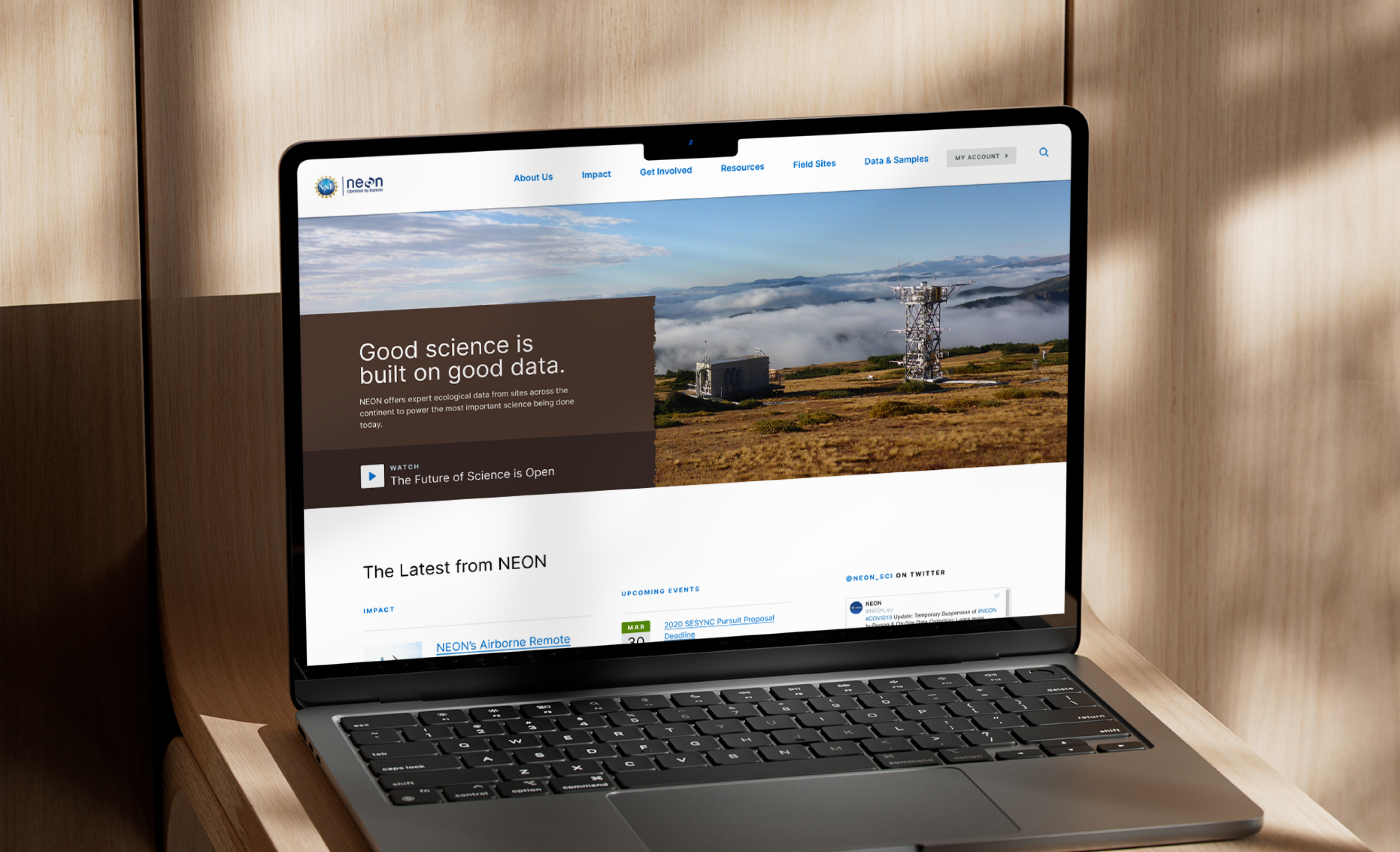
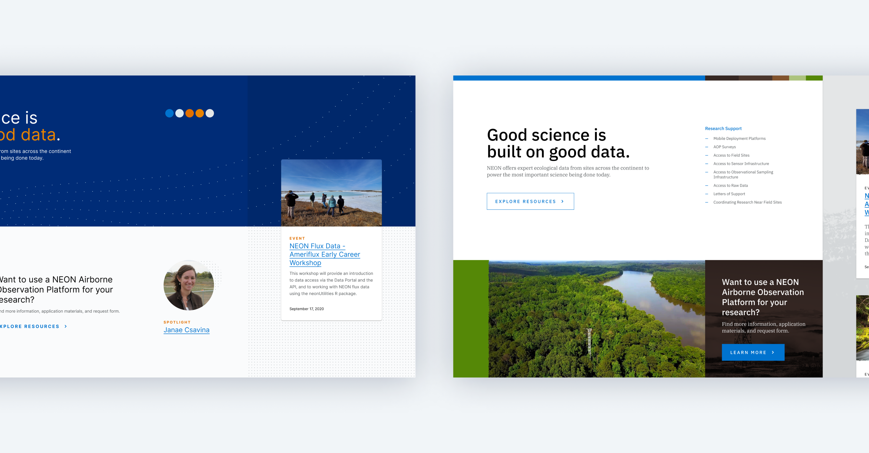
NEON had already completed discovery and design work when my work on the project began. I took that initial design work and began exploring ways to elevate the design using Style Tiles.
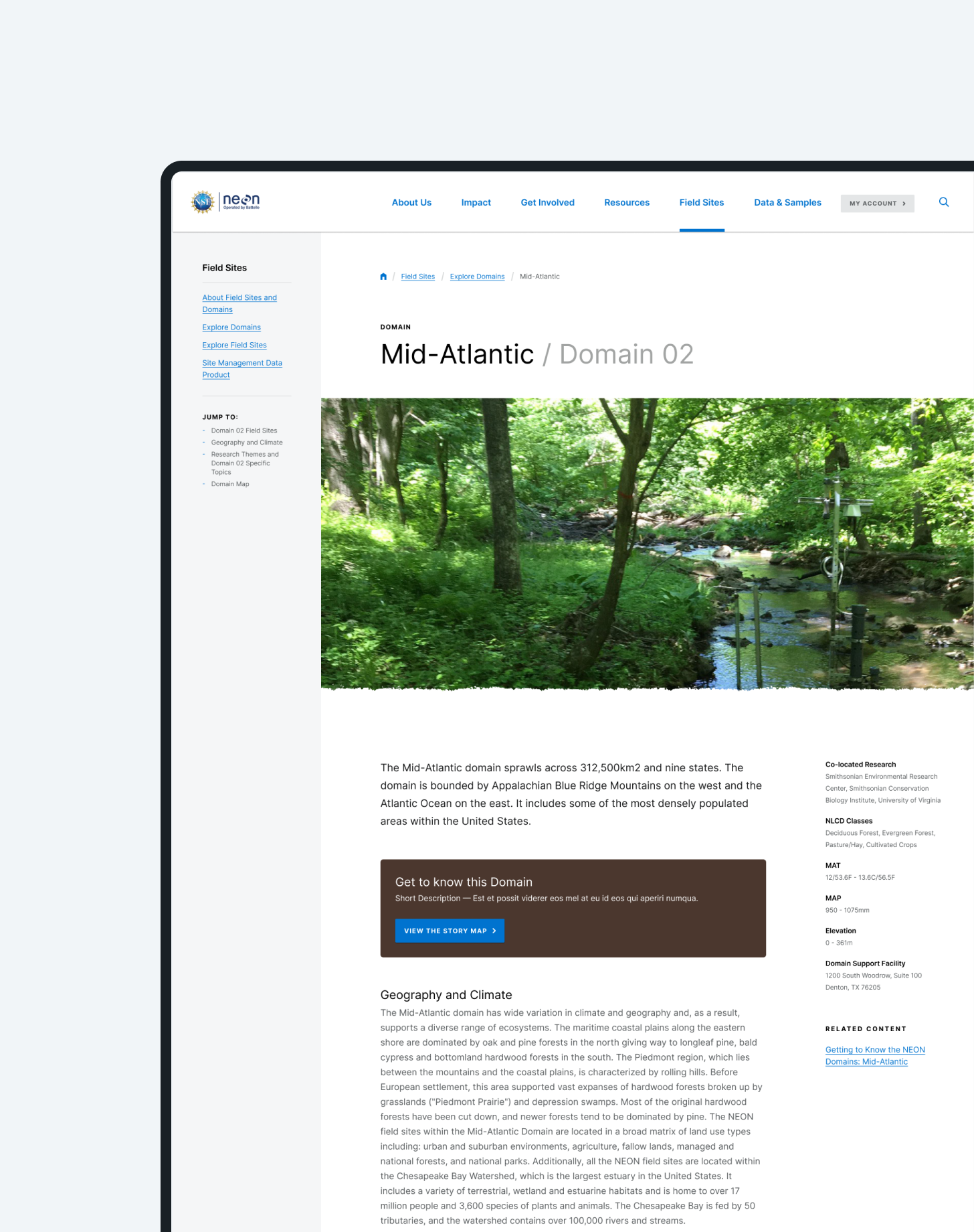
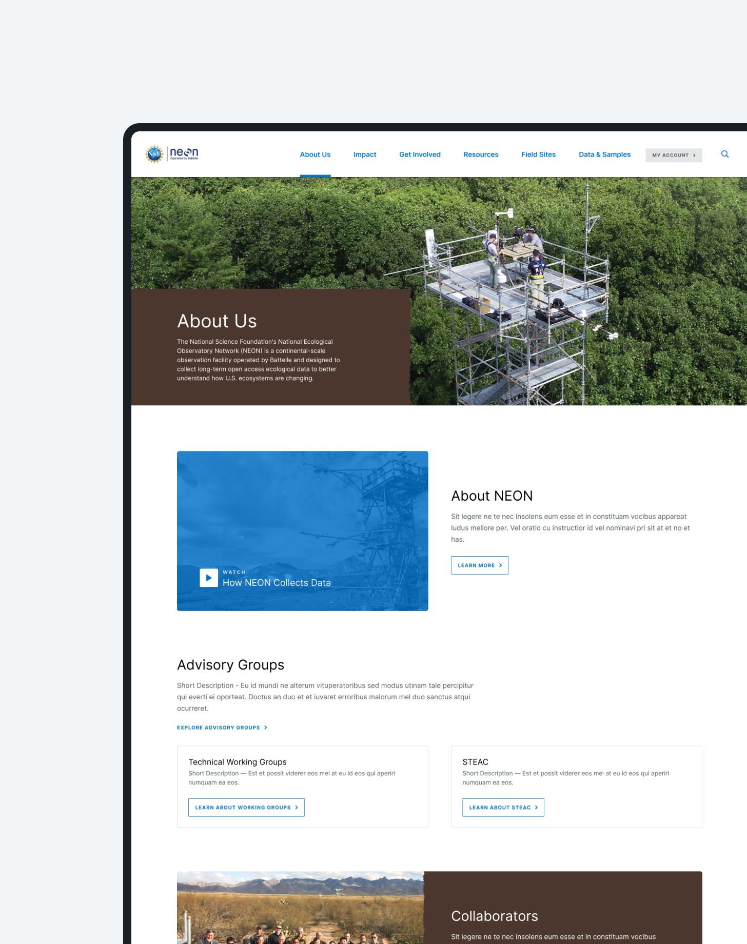
Using textures and patterns as well as a nature-based color palette, I created an uncluttered, contemporary visual framework. I then designed select pages to show how the new direction could apply across various parts of the site.
Finally, I documented the design for the client and development team to ensure the implementation matched the vision.
Tampa International Airport
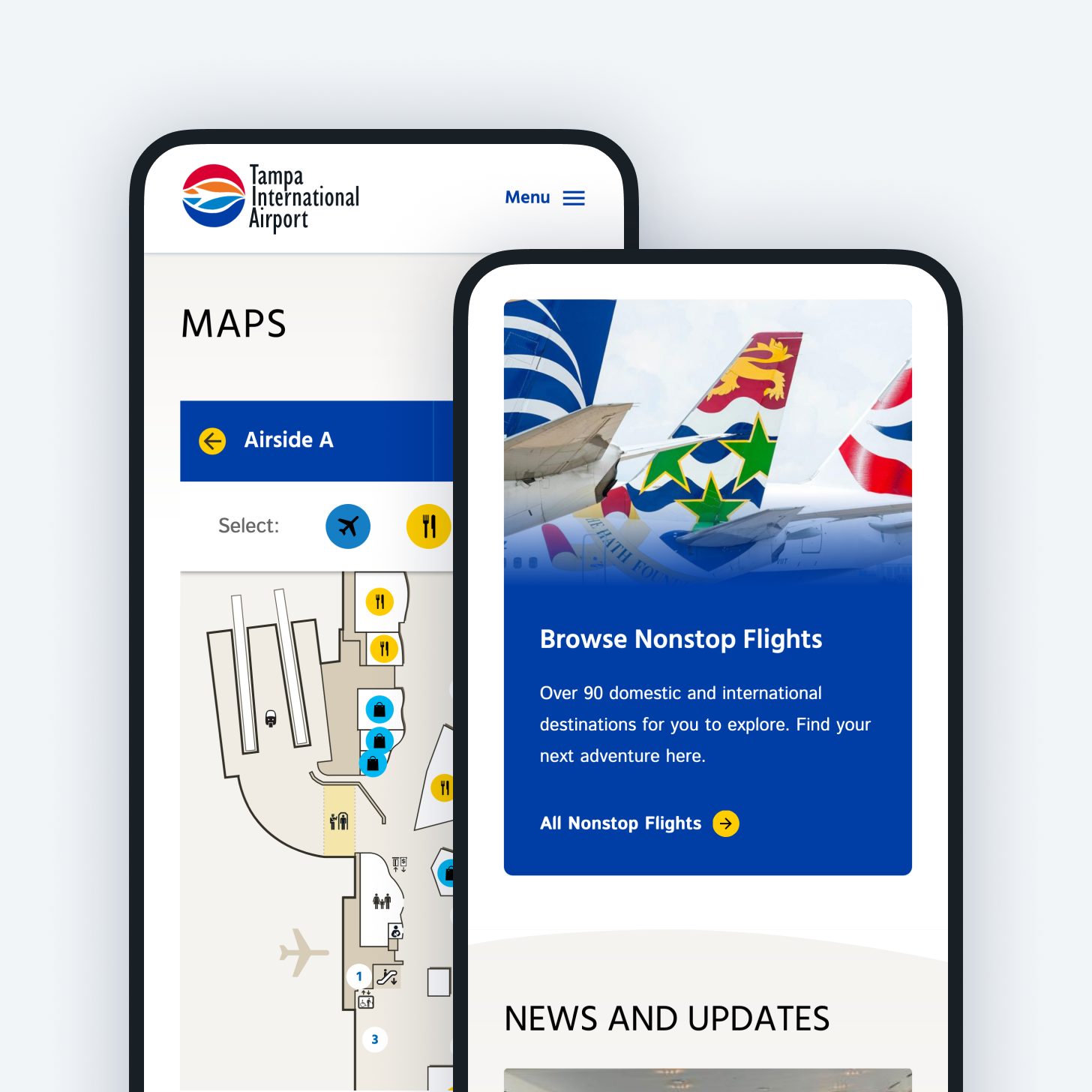
Tampa International Airport serves more than 21 million passengers per year and is ranked among the best airports in the United States. They needed a website that would compliment the exceptional in-person experience for their travelers both before and during their trip.
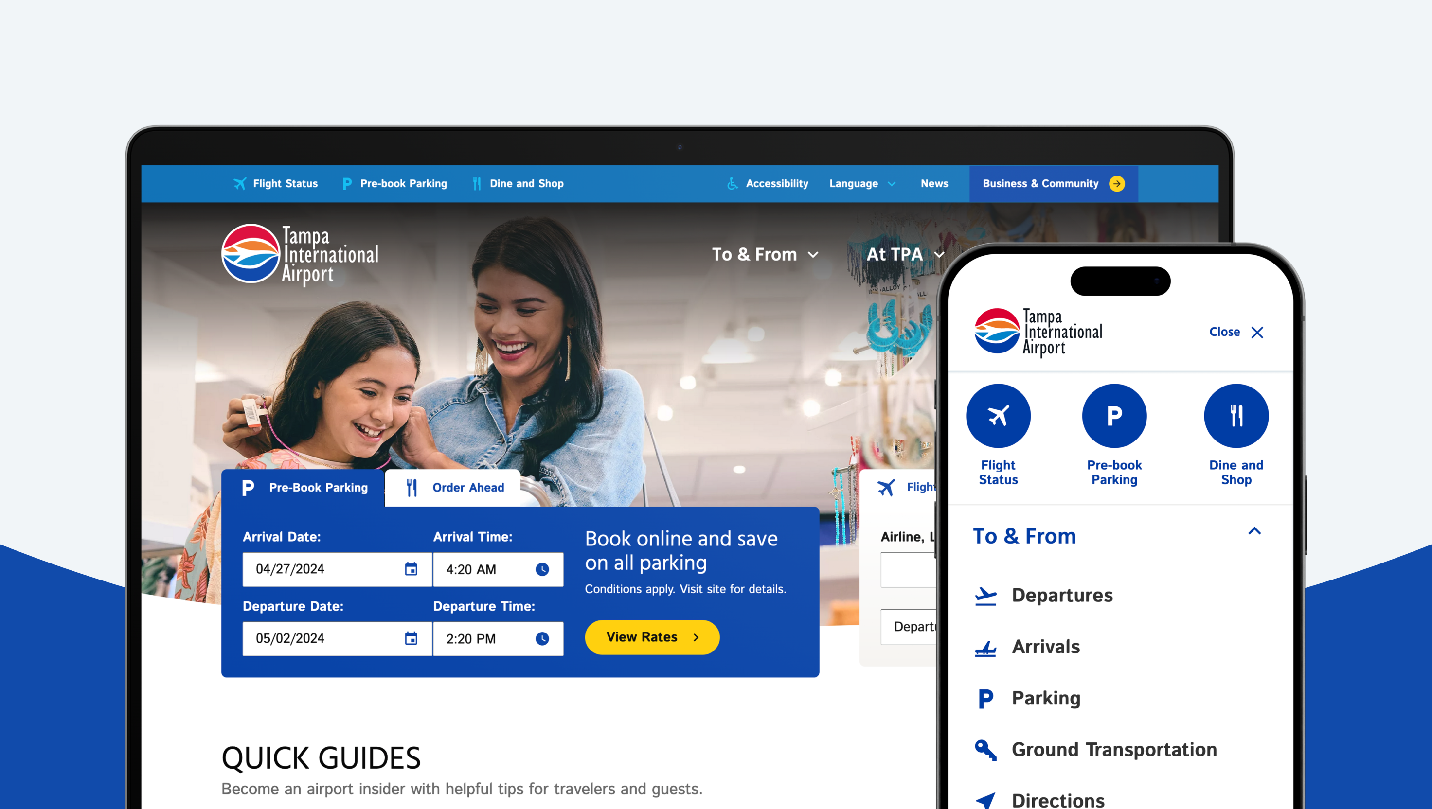
Tampa International Airport (TPA) is one of the most unique airports in the country, using a hub-and-spoke structure that makes getting to your gate an almost effortless experience. Travelers who visited the airport couldn’t say enough positive things about it. Capturing this same experience on the web was the greatest challenge of this project.
During in-person workshops with both travelers and airport staff the Aten project team learned about the many ways the airport serves its audiences. I led remote design workshops to understand how the new website design could best represent the experience of traveling through the airport while staying true to the TPA brand.
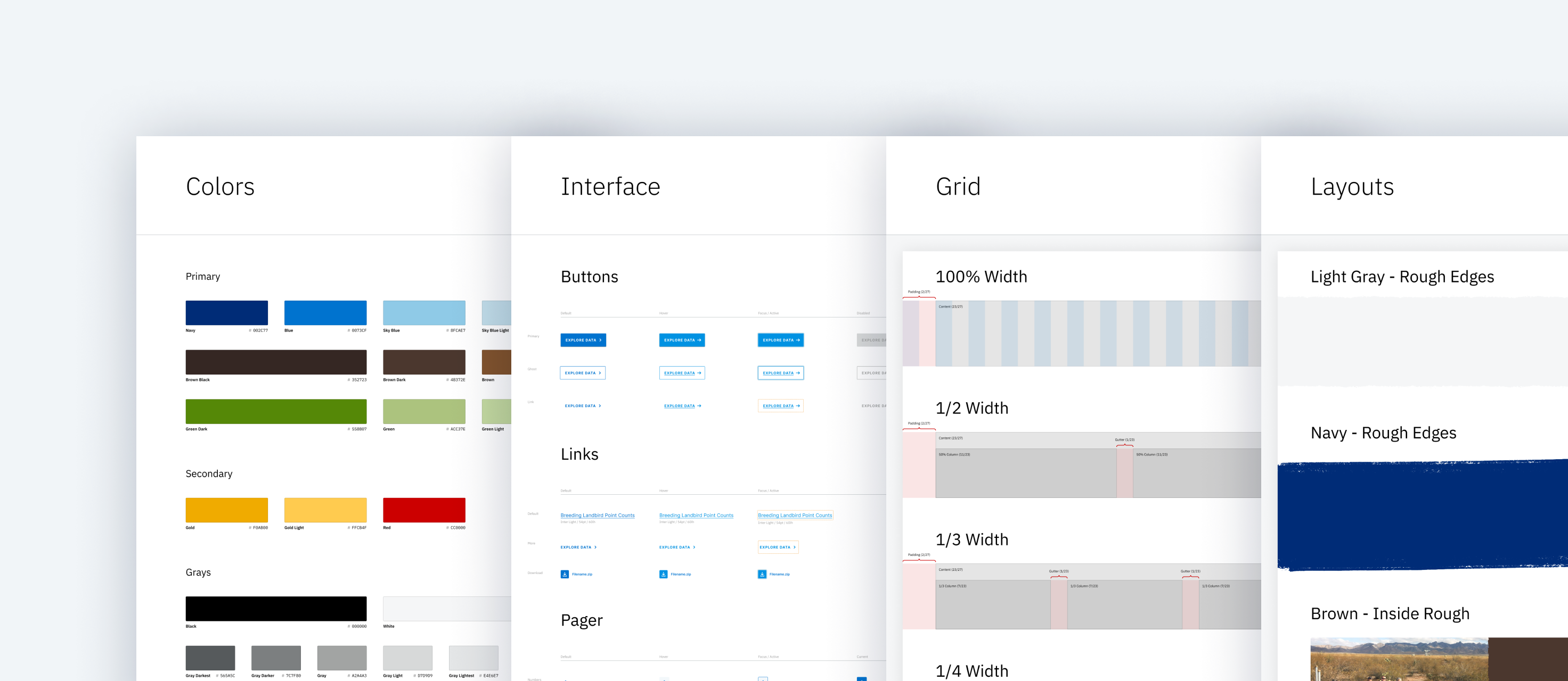
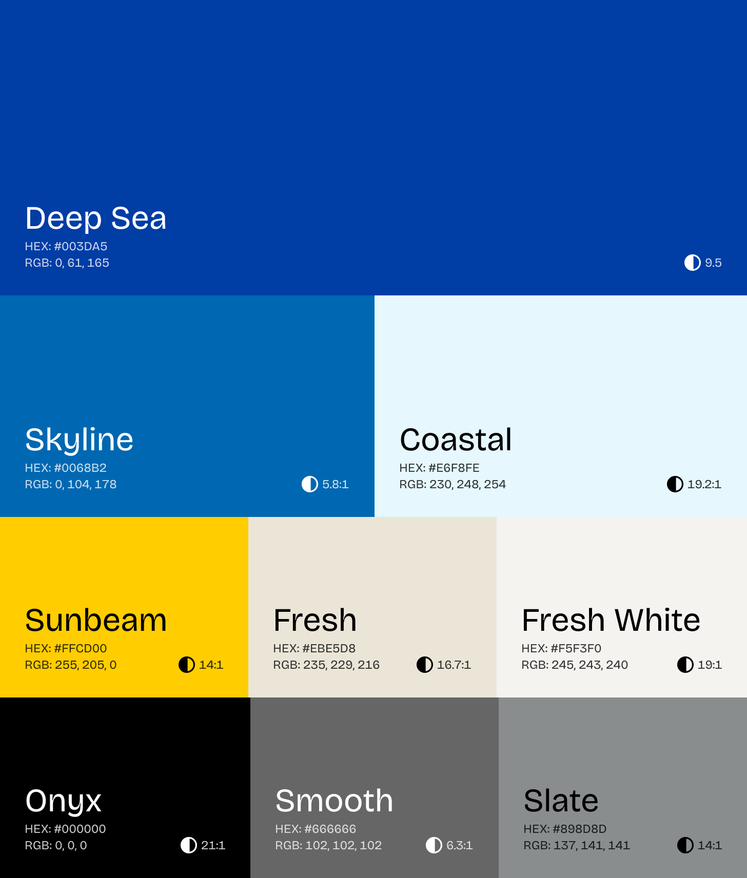
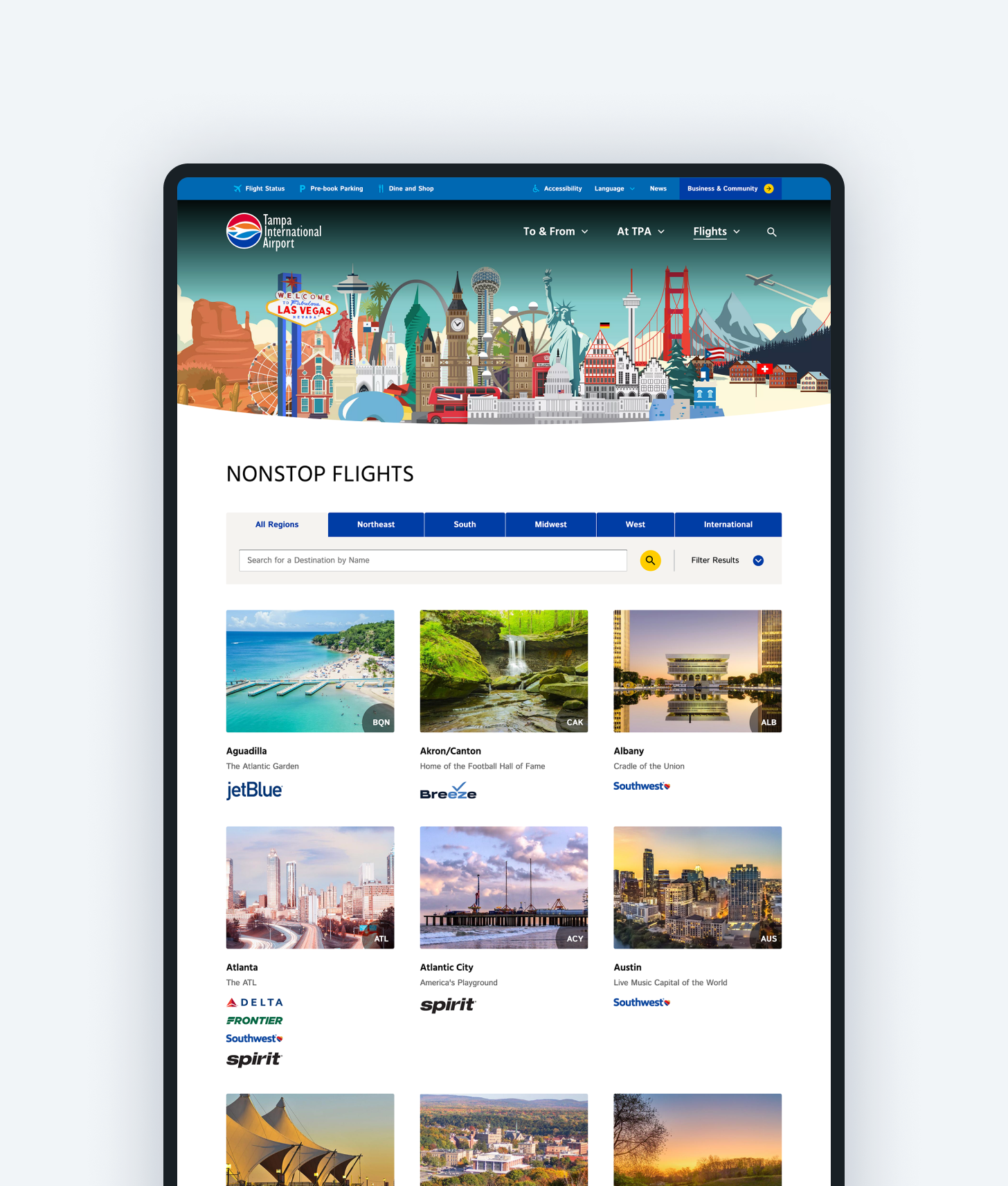
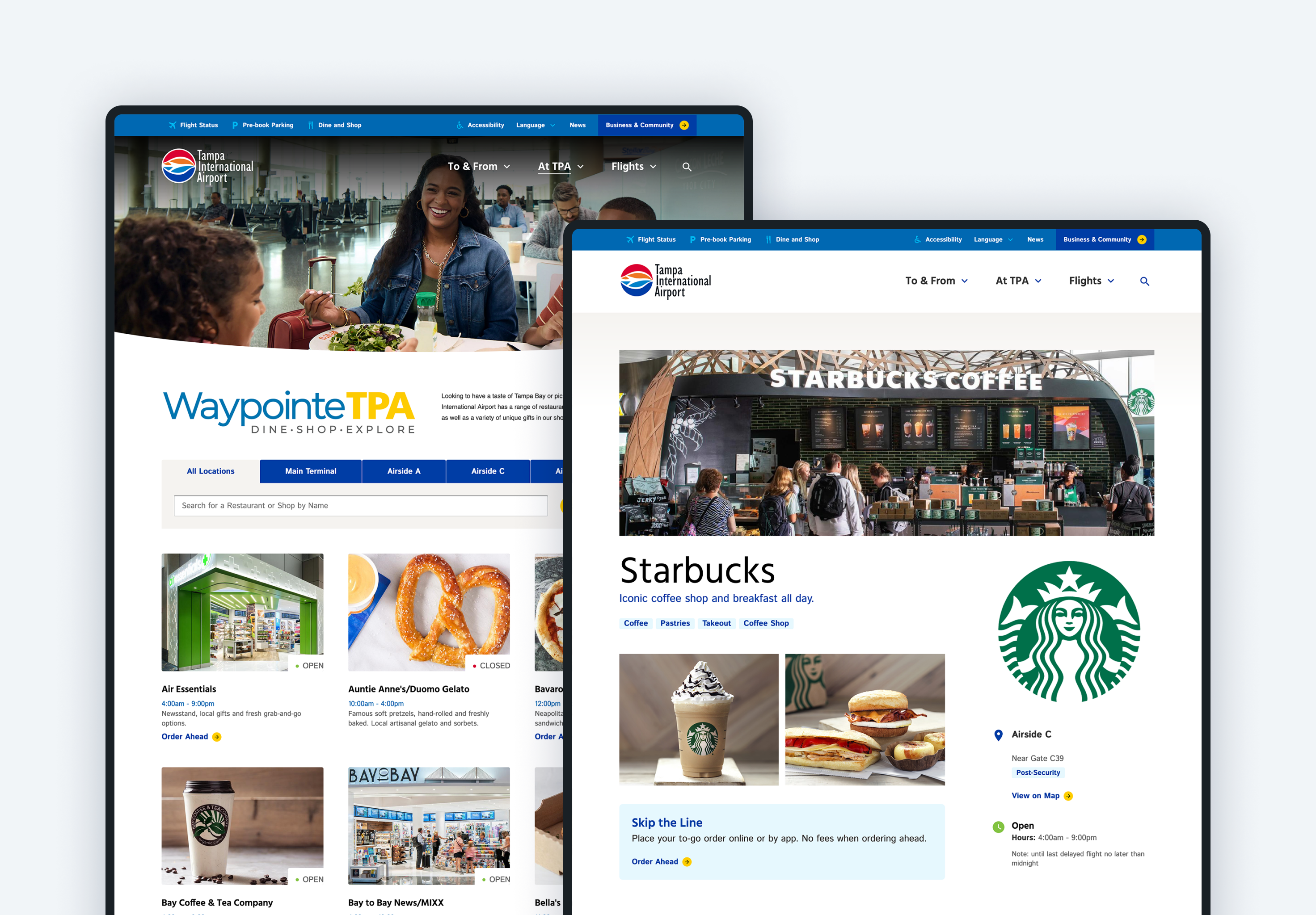
Through an iterative design process I created multiple rounds of page designs, each time moving closer to the final direction. The resulting website captures the bright, beachy aspects of the airport within a user-focused, accessible design.
